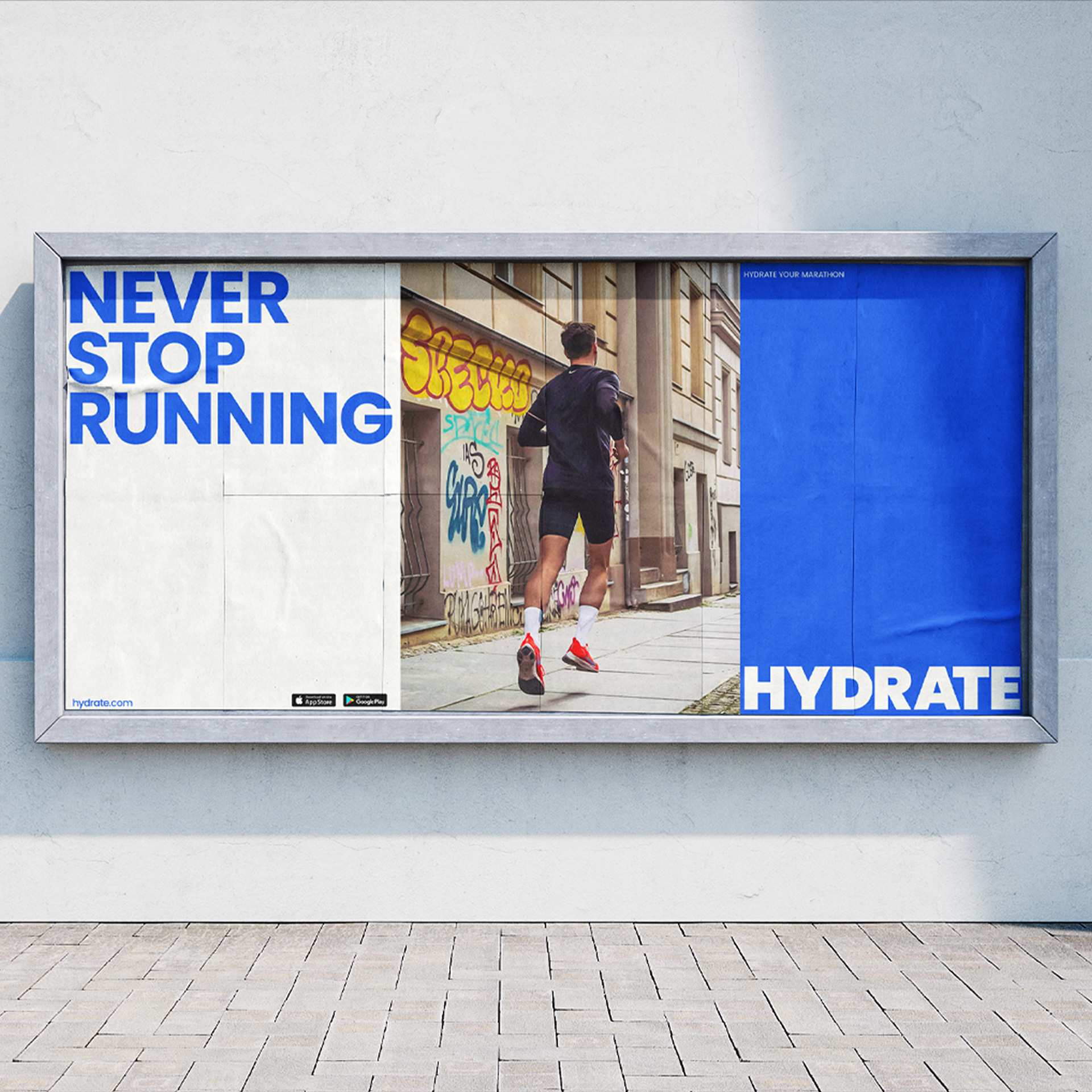
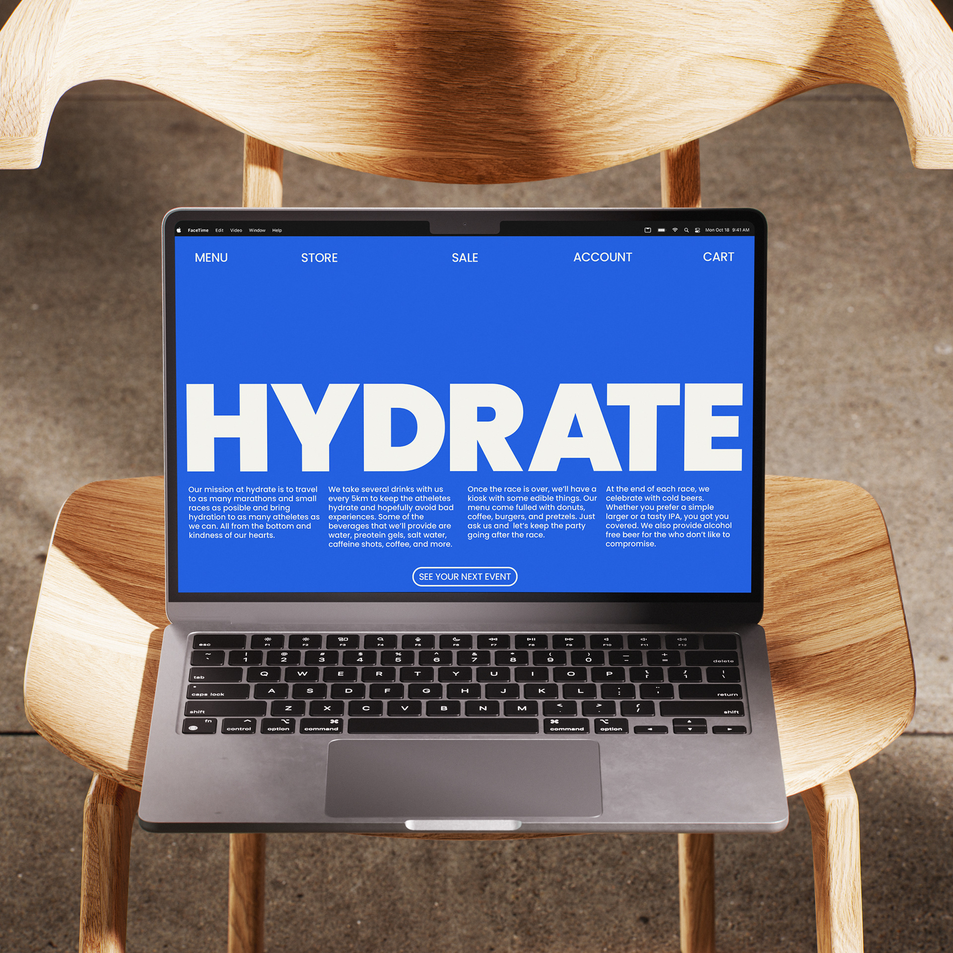
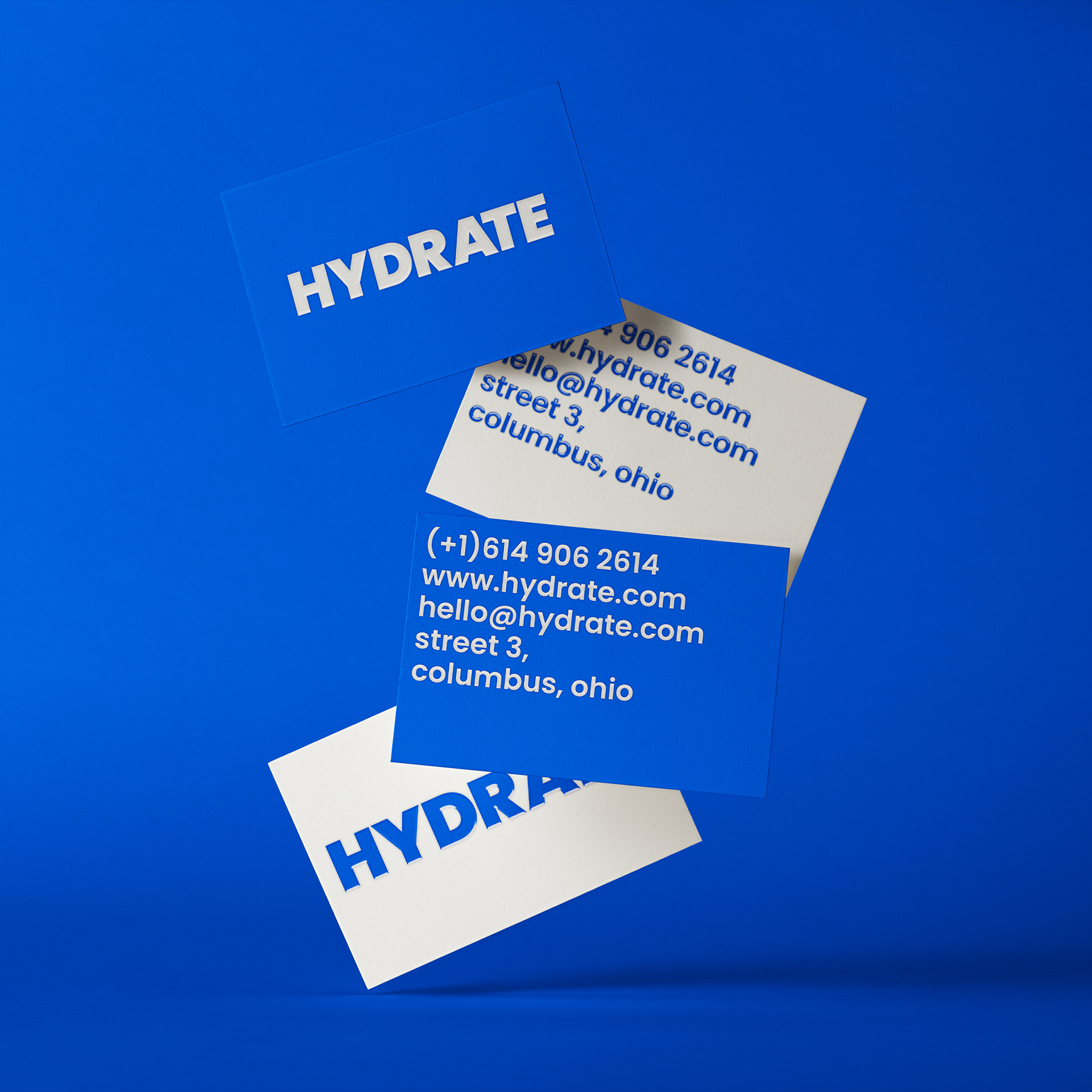
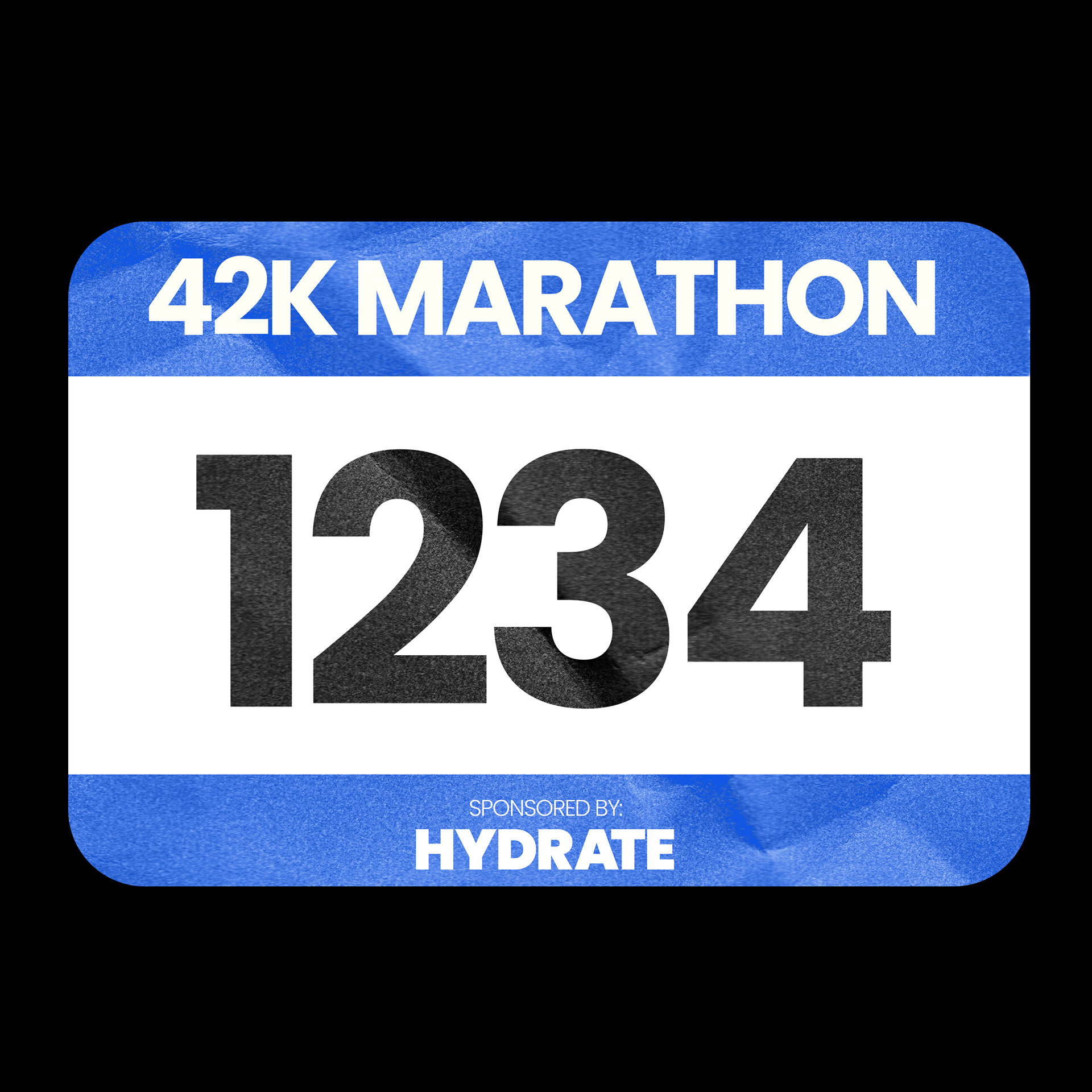
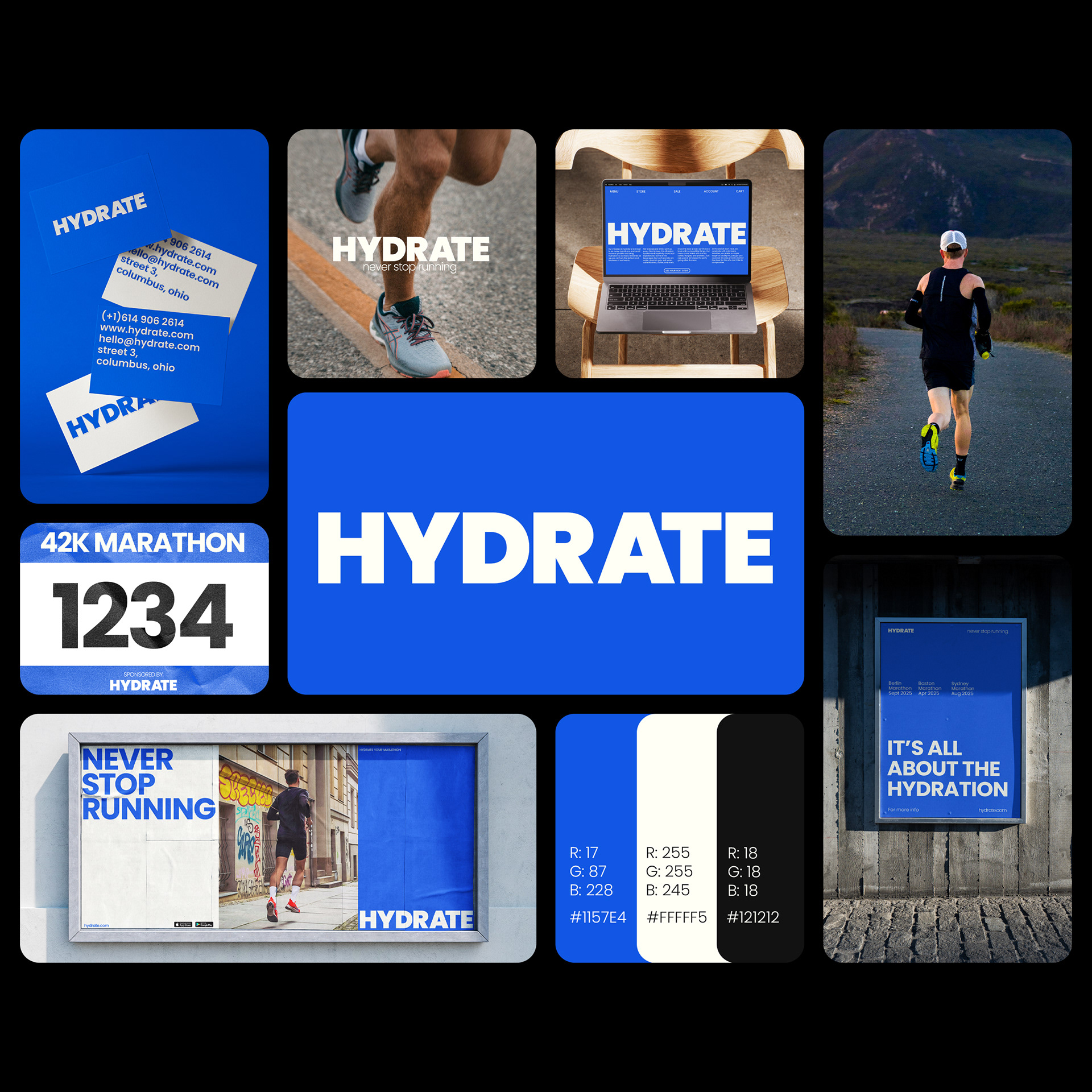
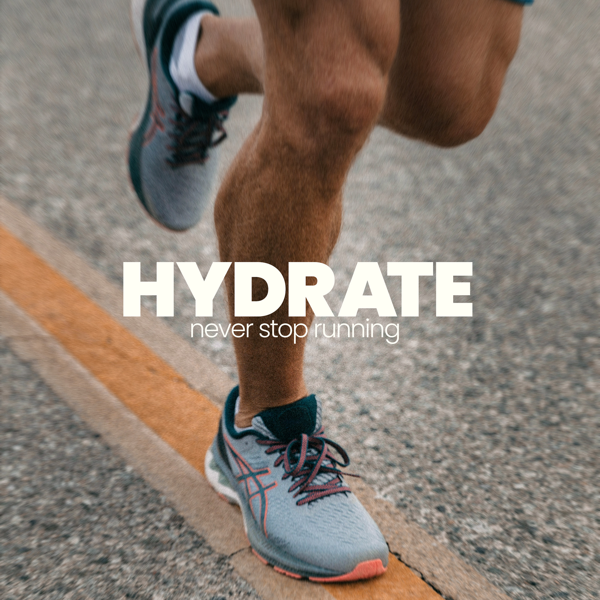
Hydrate is a passion project inspired on a company that focuses in bringing liquids, gels, and electrolytes to athletes during marathons and high endurance competitions. With a simplistic art direction.
The problem was to adhere to the saying “less is more” and to keep the branding simple, yet cohesive, minimalistic, but impact and keep a limited color palette and be able to stand out. Another obstacle was to make all the elements come together as one consistent visual identity.
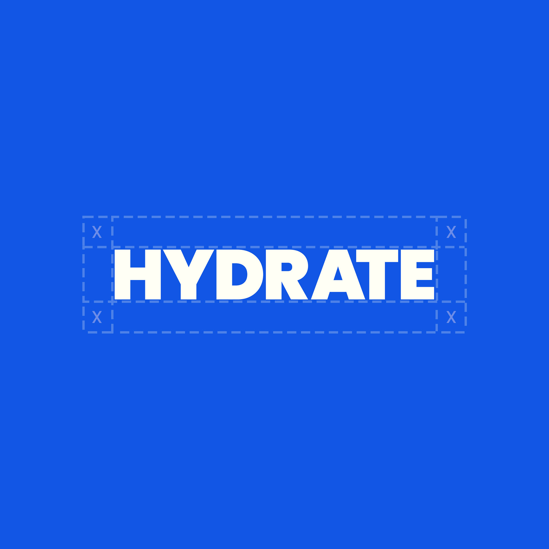

Conceptualised the idea of designing a hydration brand that could be recognised without the need for using water illustrations. What font will help the brand best, and which size is ideal.